We all have a purpose. OM USA’s new website is aimed at helping people find their purpose and connect it with needs around the world for a greater impact. Digizent helped OM by creating an online experience that uses quizzes, tests, and another mechanism to connect with worldwide ministry opportunities.
Digizent’s challenge was to design and build a platform that not only was easy to use by individuals combing through hundreds or career and volunteer opportunities worldwide… but also easy to manage by site administrators across multiple internal systems without using technical resources.
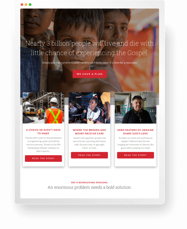

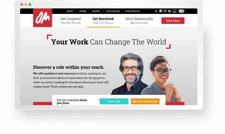
When OM USA site visitors arrive at the site, they are usually exploring how they can use their talents to open doors for service opportunities in other countries. Digizent helped by implementing a system that easily displays hundreds of opportunities to explore using various mechanisms (talking to a coach, taking quizzes, searching through variables). This system also connects seamlessly to multiple internal systems that manage the whole process and opportunity database making life easier for visitors and admins.
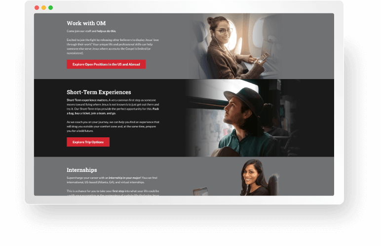
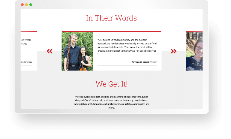
The engagement opportunities through OM are many and so a key factor in developing a quick engagement with users is minimizing the barriers to site updates. Digizent worked to build a comprehensive system that OM admins could quickly and easily manage compared to previous CMS experiences.
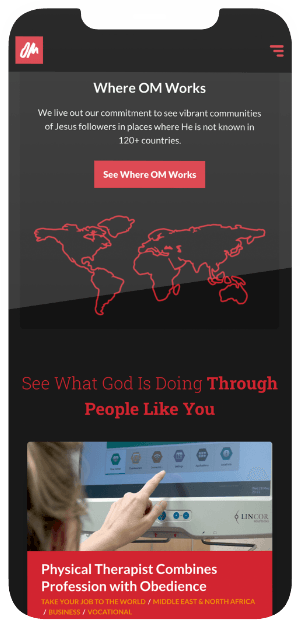
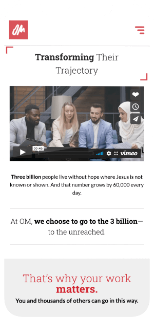

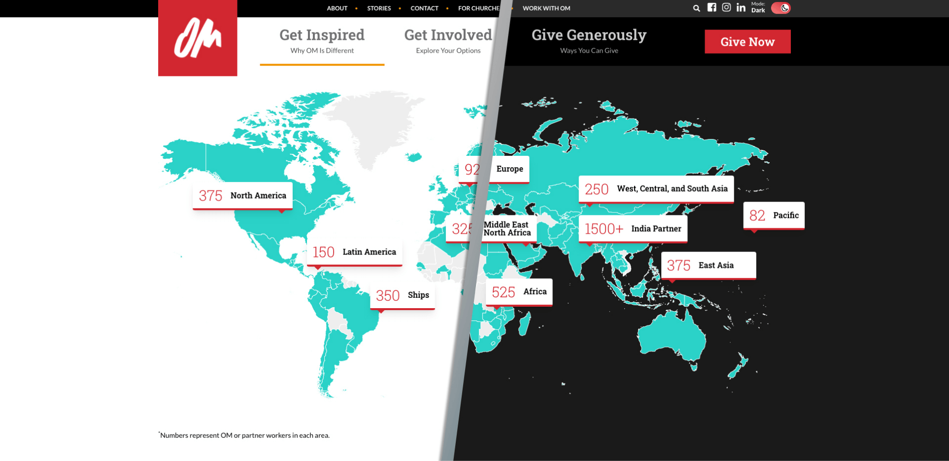
For many users, engaging in the interface across multiple mechanisms increases the complexity of the UX. But choosing how they see it makes it easier. Digizent implemented a toggle system by which users could choose how they wanted their content displays — light mode or dark — and this followed their experience in every area of the site. Regardless of the visuals, it all looks seamless and engaging to the visitor.

